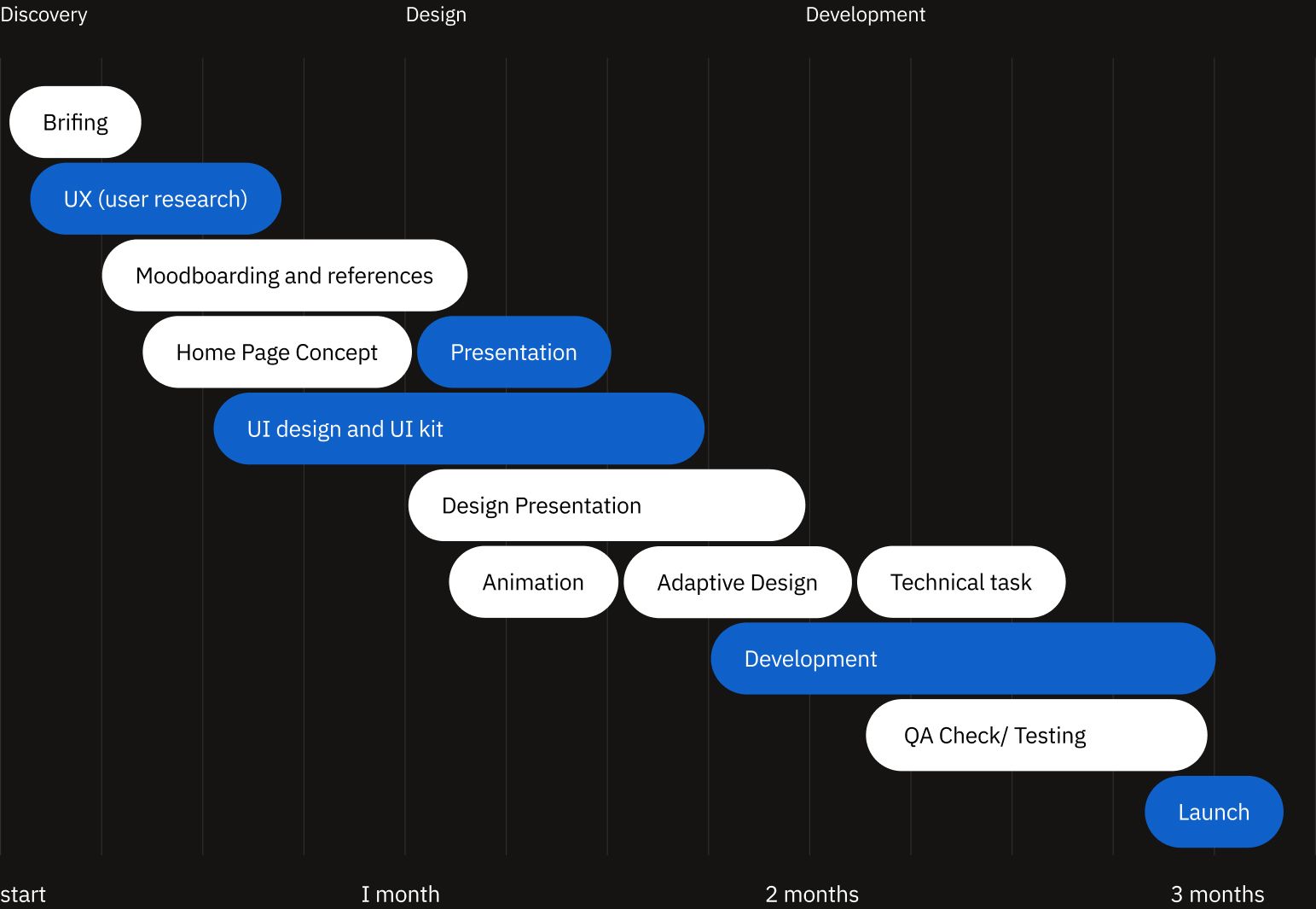
UX research project, to explore in more detail the audience of the 22-product video production. Redesign the site based on information obtained from the audience research. Analyze the effectiveness of the new site.
Check live website

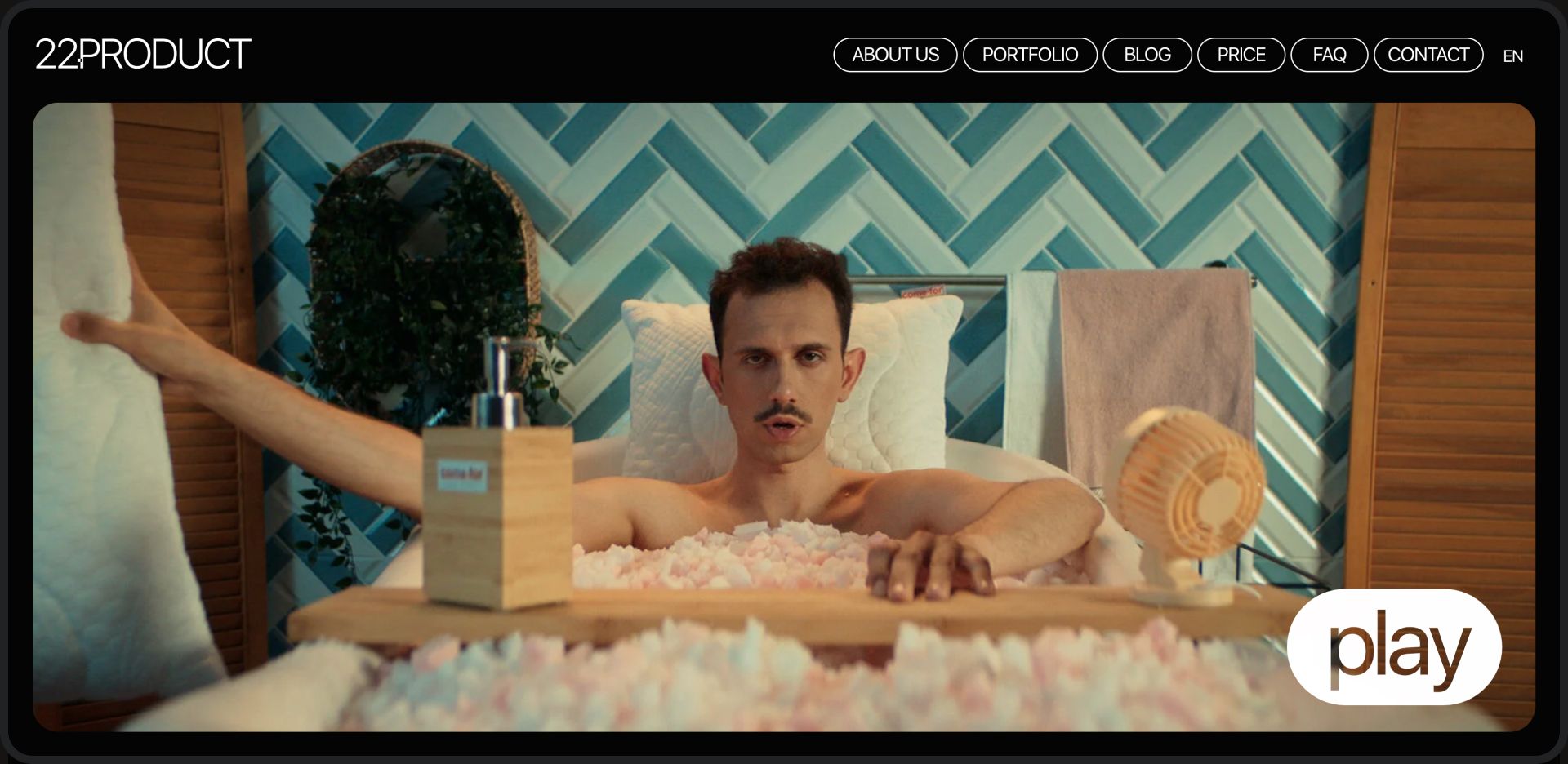
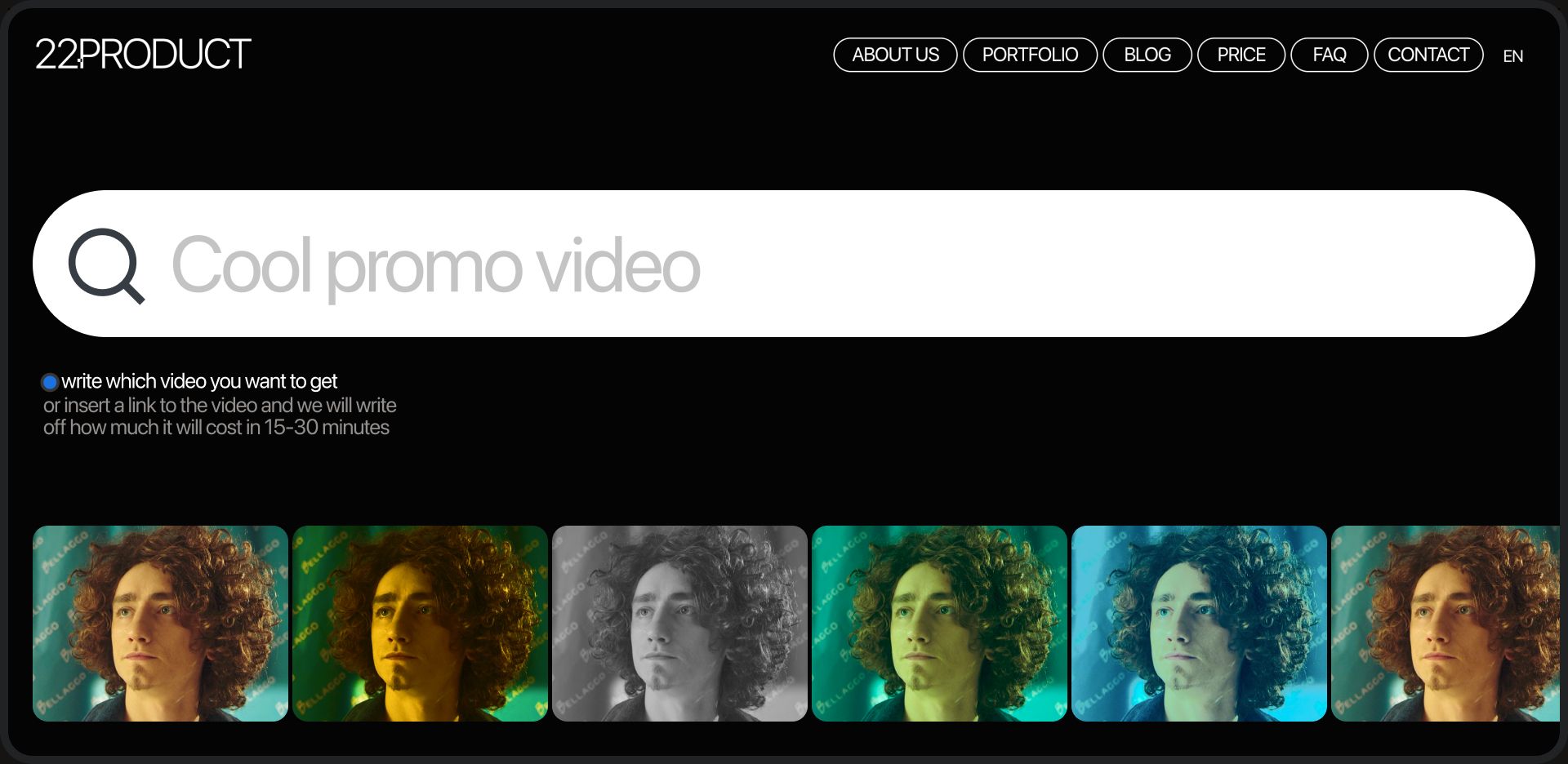
The main emphasis was placed on the portfolio of the studio, so we simplified the interface as much as possible, without unnecessary graphics, only to view and read the functionality in more detail for the very curious.
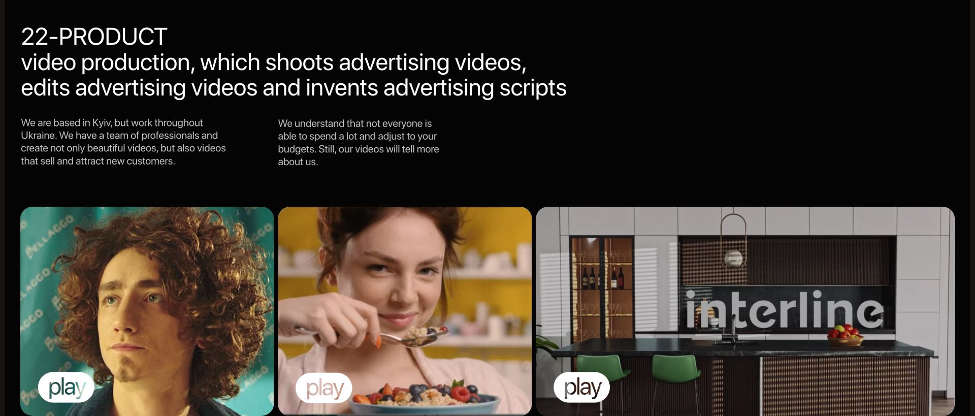
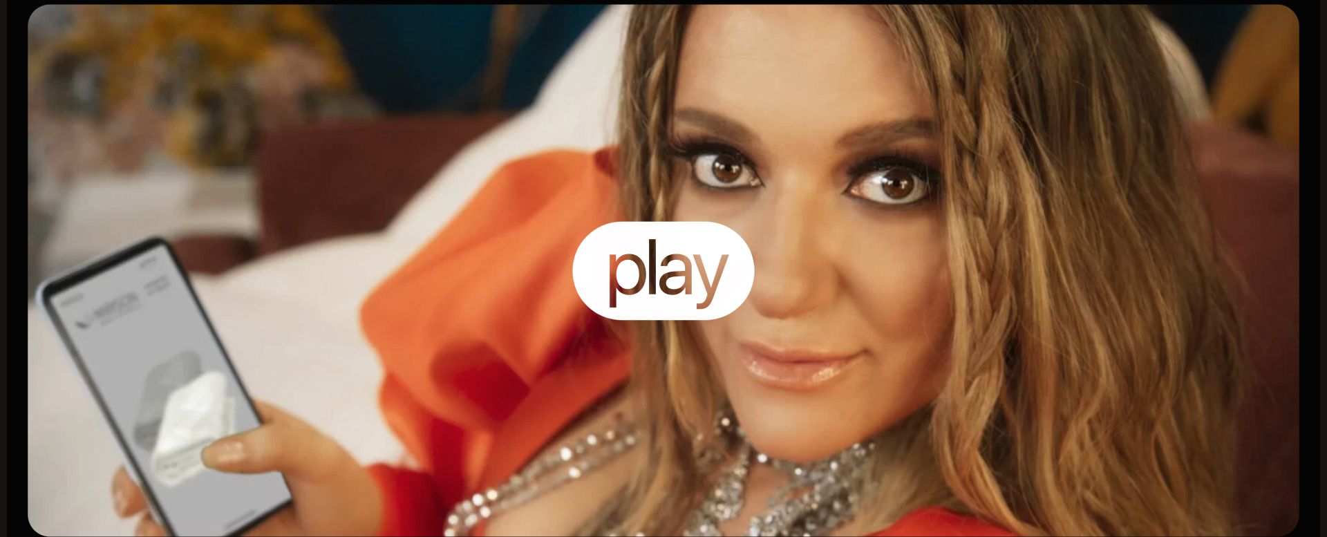
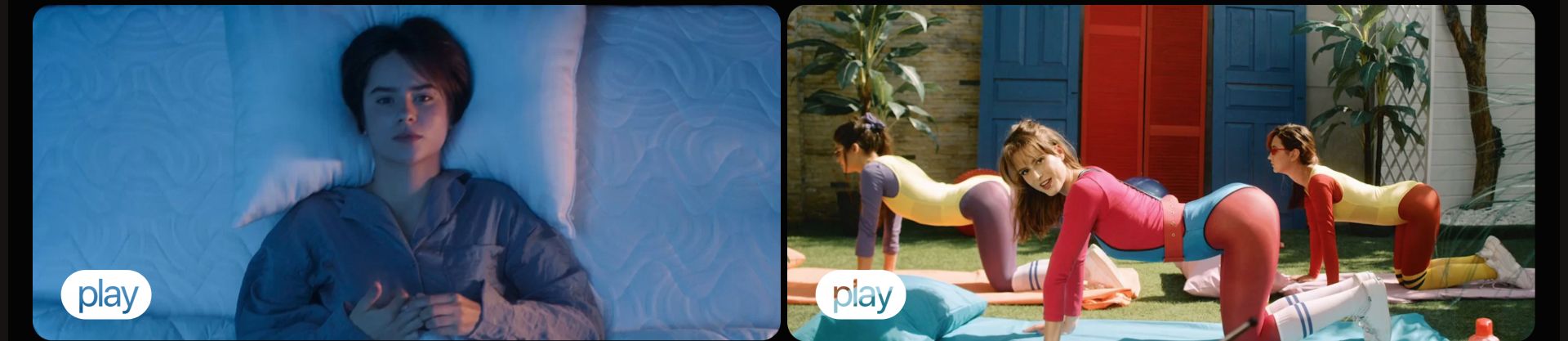
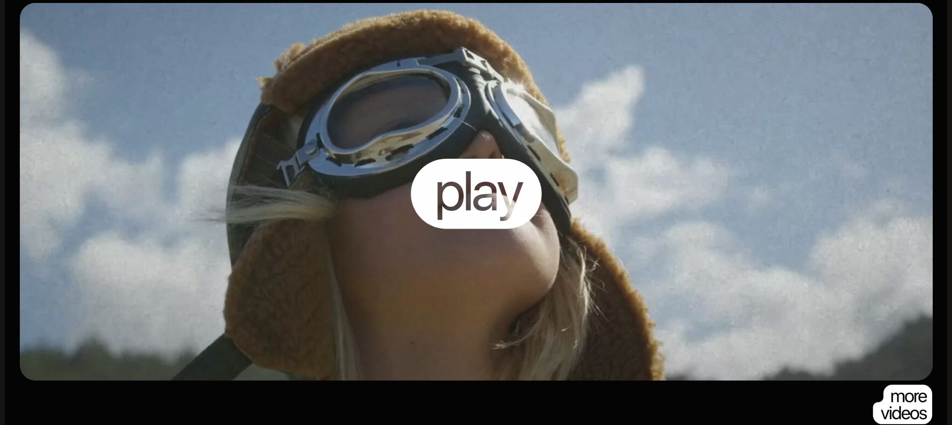
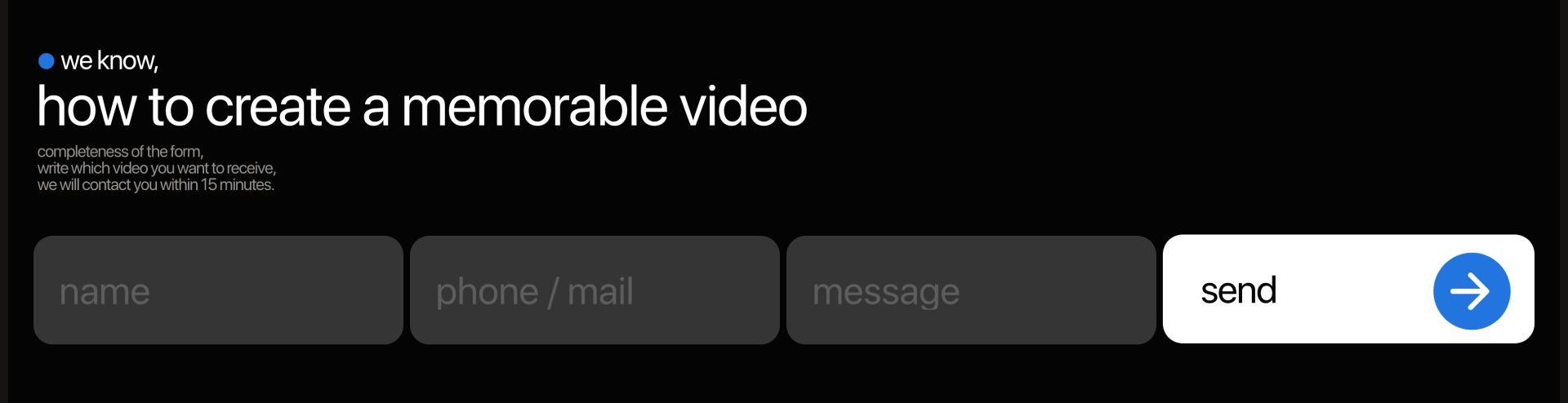
Different forms were used for testing on the site, but everyone has the same task - to get customer contact. After the result of the A / B test, the most effective ones were installed on the site.
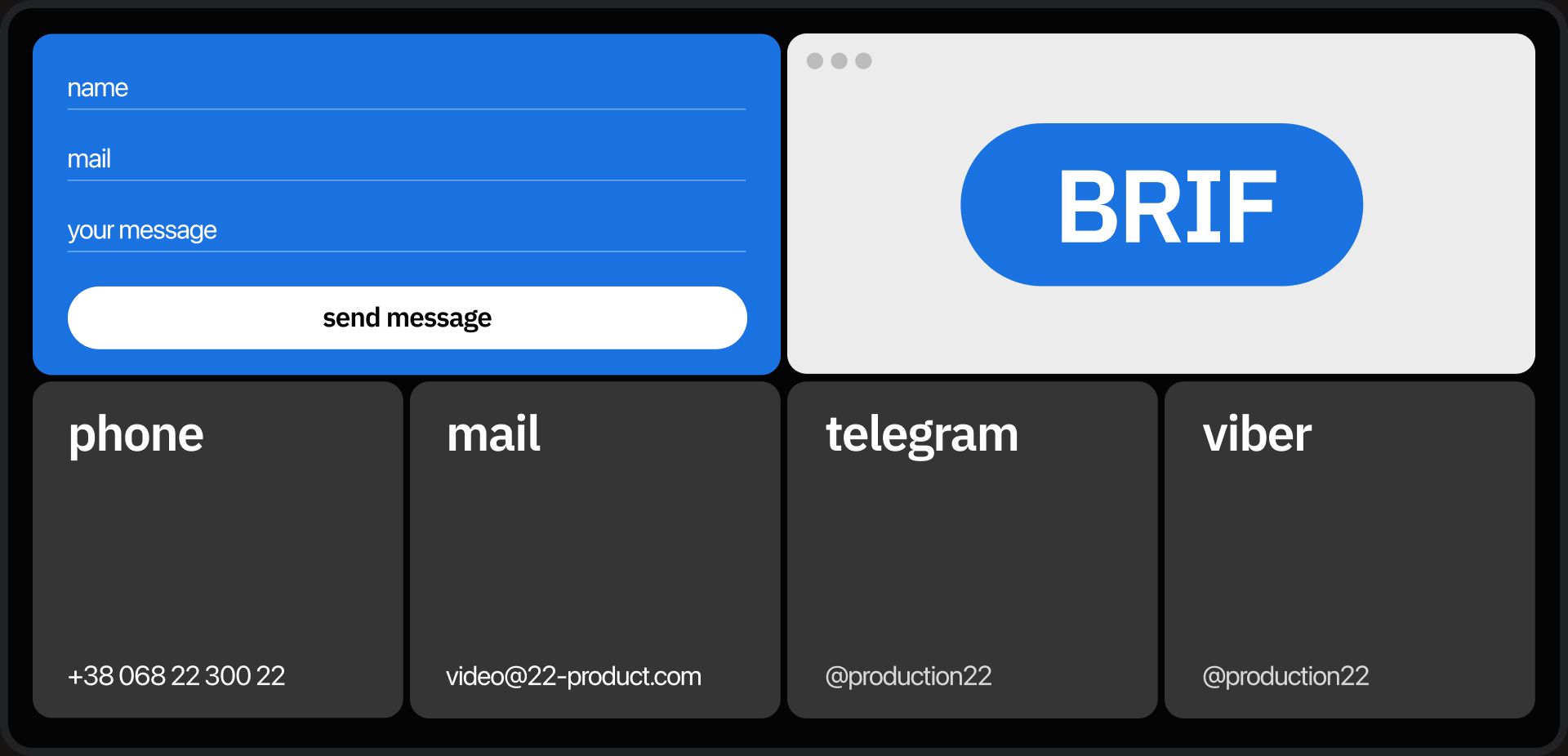
It is also important that customers notice the brief. That's why it's so big in the footer of the site.
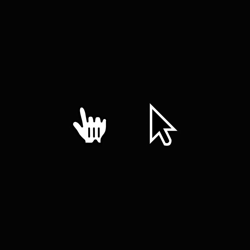
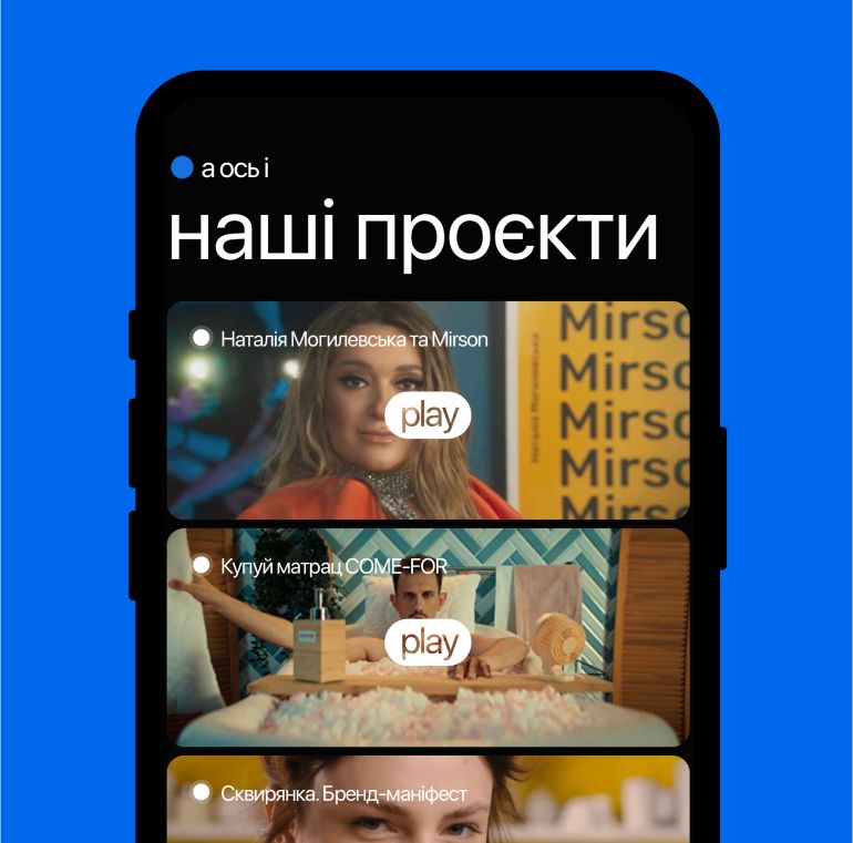
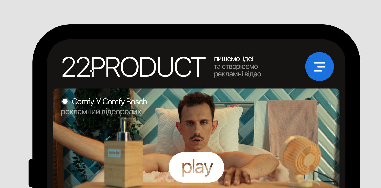
The main style consists of large buttons, enlarged cursor, and tiles that are as close as possible, thus creating the mood we need: the emphasis on cool work and emphasis on individual elements.

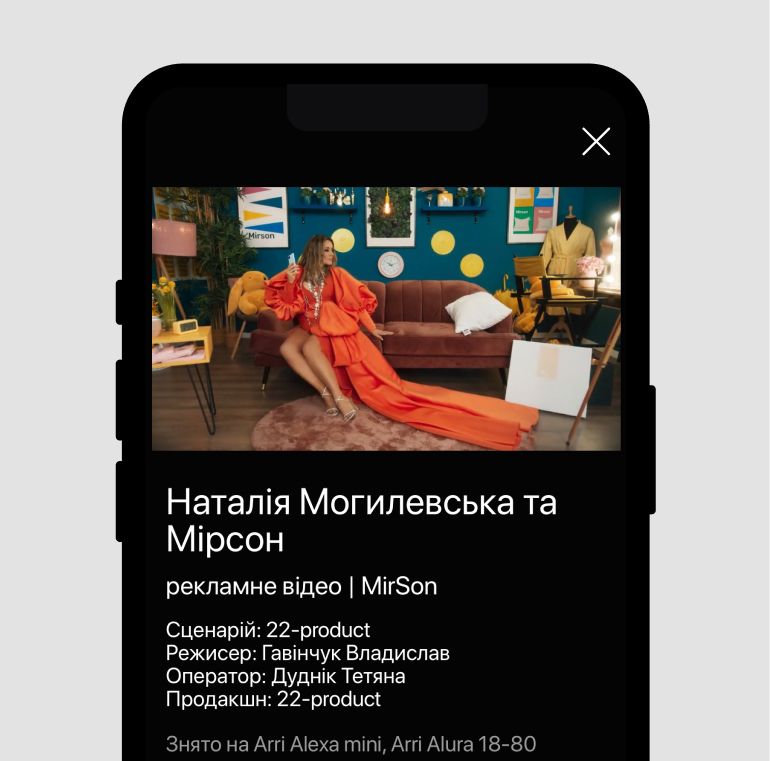
The mobile version managed to convey the concept. Minimalist style, created tension through almost tangent large elements
In the first two months since the project was launched, all important indicators have increased.Received positive feedback from customers. The site won the award as the best on the platform on which it was made.