640,000+ hectares, 12 modules and one phone in an agronomist’s hand. I designed an app that works where agribusiness works — in the field, in the sun, on the road.
Every screen serves one action. Look. Decide. Move on.
“We want to run our agribusiness from a phone.”
In 2025 a client called me — an agricultural holding in Central Asia. The idea sounded simple. Behind that one sentence stood 12 modules, each with its own settings, parameters and logic, split into two big worlds: scouting and machinery.
The real goal went deeper: a digital footprint of the farm. Crops, machinery, people — year after year. So that at the end of a season you can look back and do better next year.
Who opens this app — and where are they at that moment?
Analytics, planning and reports live in the office. The phone comes out when something happens.
Open the app for a minute, see how things stand, get an urgent alert and step in.
Low contrast and small buttons simply disappear in the field.
Some people read dashboards, others enter data from the field. Mix them — and both get worse.
One insight drove everything.
The easiest path was to squeeze the desktop into a phone. It was also the worst one. Instead I split the roles: desktop is for analysis and planning, mobile is for reacting and entering data right where that data appears.
| Desktop | Mobile | |
|---|---|---|
| Where | Office, big screen | Field, road, sun |
| When | On schedule | When something happens |
| Job | Analyse, plan | React, enter data |
| Session | Hours | Minutes |
How might we fit 12 agribusiness modules into a phone lying in the sun in an agronomist’s hand — without losing a single decision?
Here’s how I did it ↓hectares under management
active users
modules, each with its own logic
phone to run it all
An interface you can read in direct sunlight.
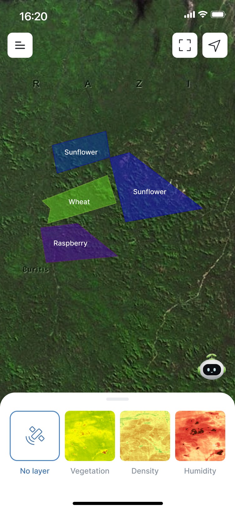
Minimum contrast ratio 5.9:1 — and most elements go well beyond it. On the map, buttons are white against a dark map, so they stand out even in direct sun.
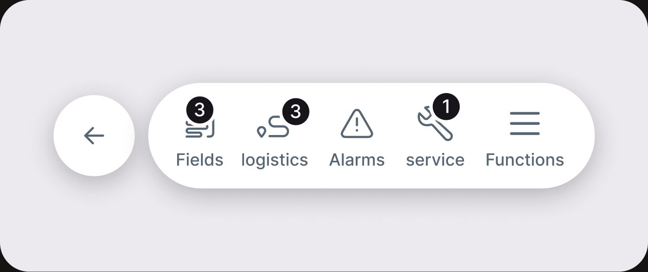
Primary actions live in a floating toolbar at the bottom of the screen — within reach of one hand.
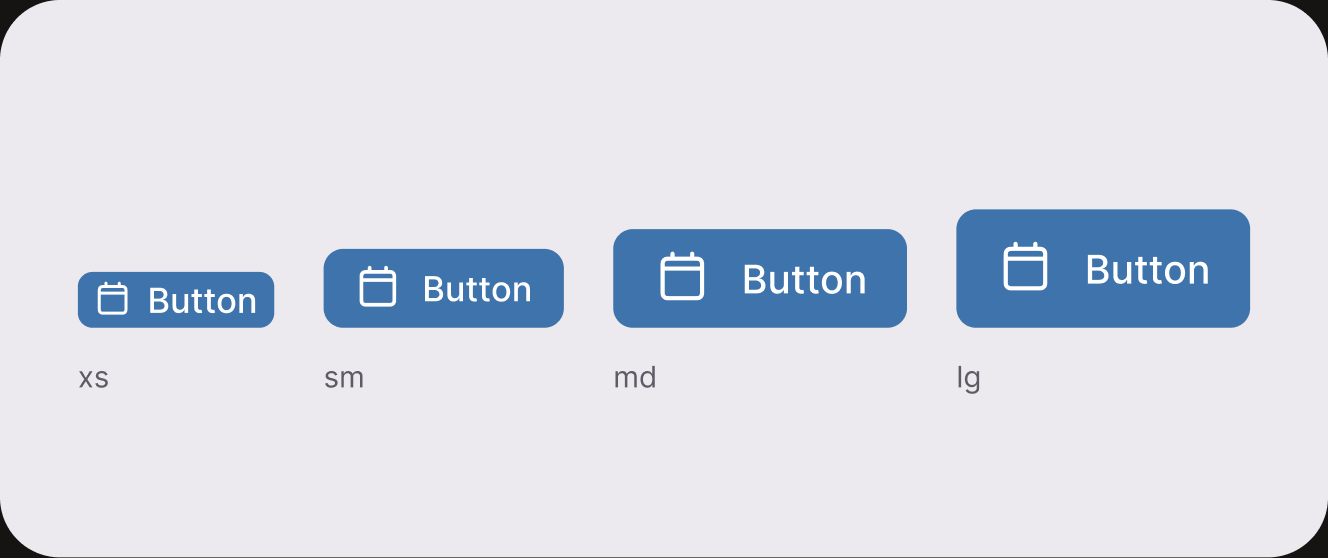
Large buttons you can hit with a thumb on the move, without zooming or aiming.
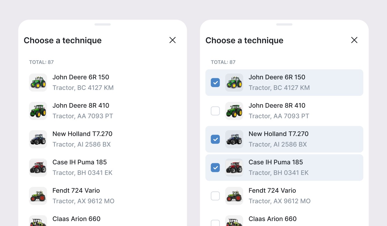
Viewing data and entering data are separate scenarios, so they never get in each other’s way.
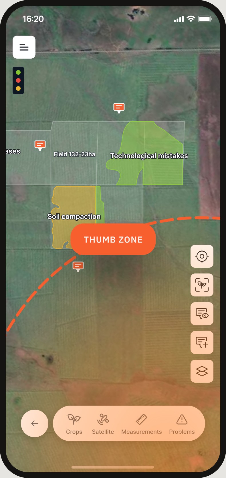
One hand holds the phone. The other is busy.
Everything important is reachable with a thumb.
An agronomist stands next to a new field and has to outline it. On desktop that’s a mouse job. On a small screen, in the sun and on the move, it’s a genuinely hard task.
I looked at how navigation systems map new roads and objects, and brought that pattern to field mapping. The crosshair stays in the centre and the user moves the map. In the right spot — tap + Add to drop a point. Once the points close, the zone forms and you give the field a name.
Made a mistake? The brush removes the last point. Leave without saving — and the contour is simply discarded.
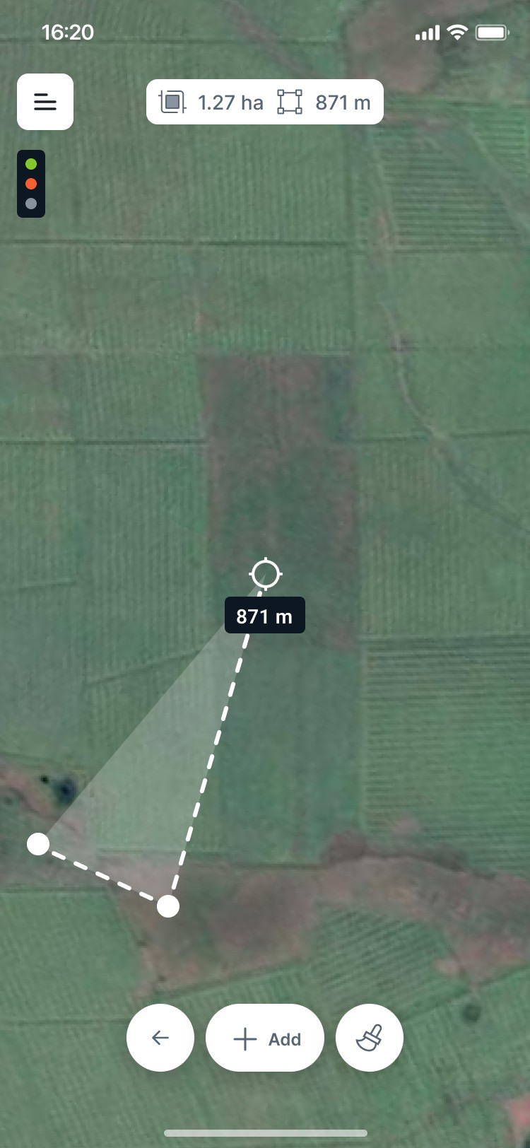
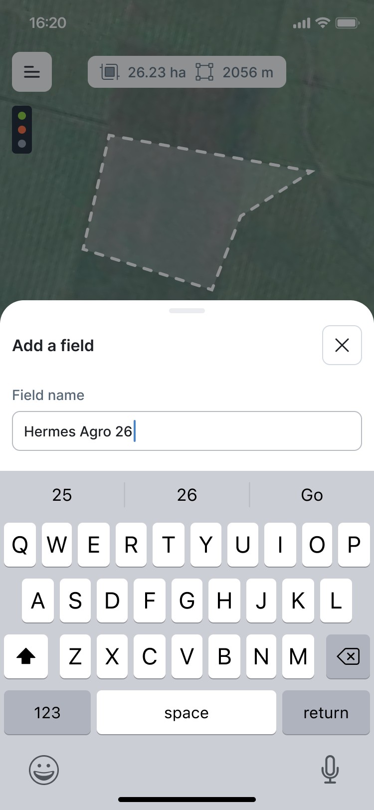
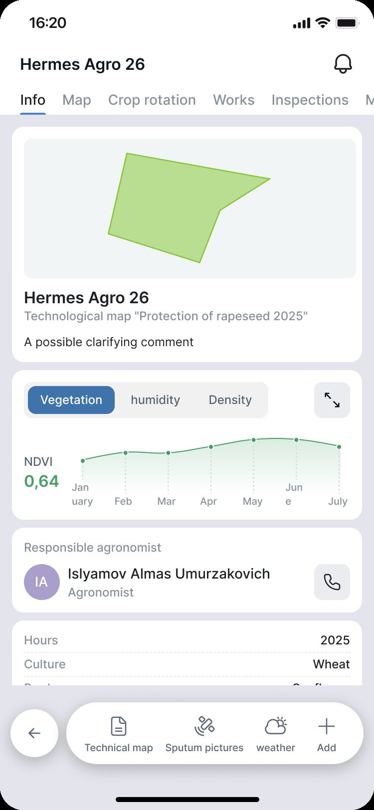
Move the card. Tap “+ Add.” Enter a field name.
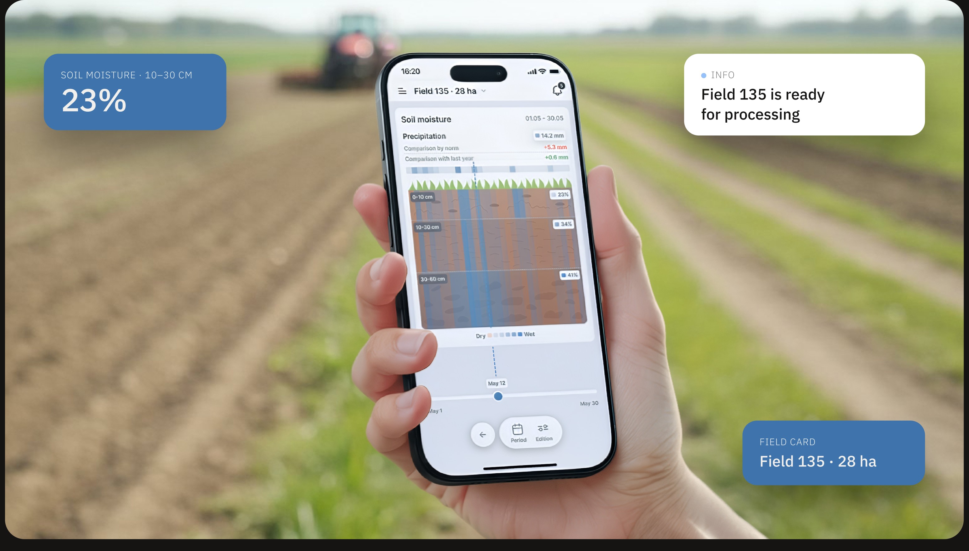
A regular forecast shows the sky. A farmer needs to know what’s happening in the soil. For every field the app shows moisture by layer — 0–10, 10–30 and 30–60 cm — against the norm and last year, with a slider through the month. Moisture at seed depth is what tells you whether it’s time to sow.
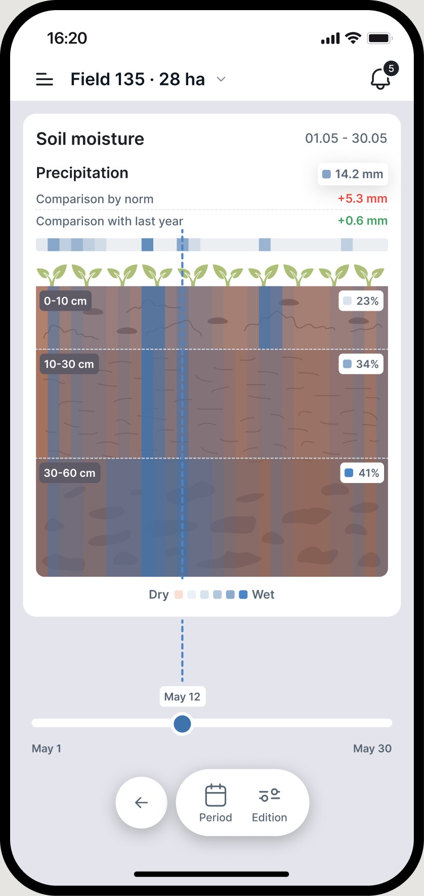
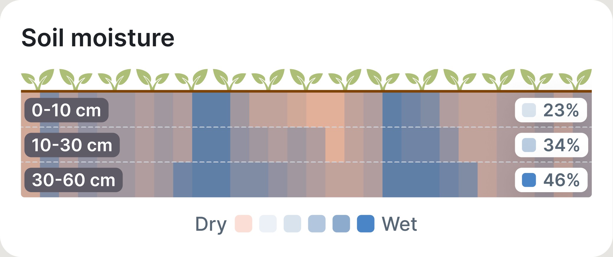
Soil moisture is not a number. It’s a decision: sow now or wait.
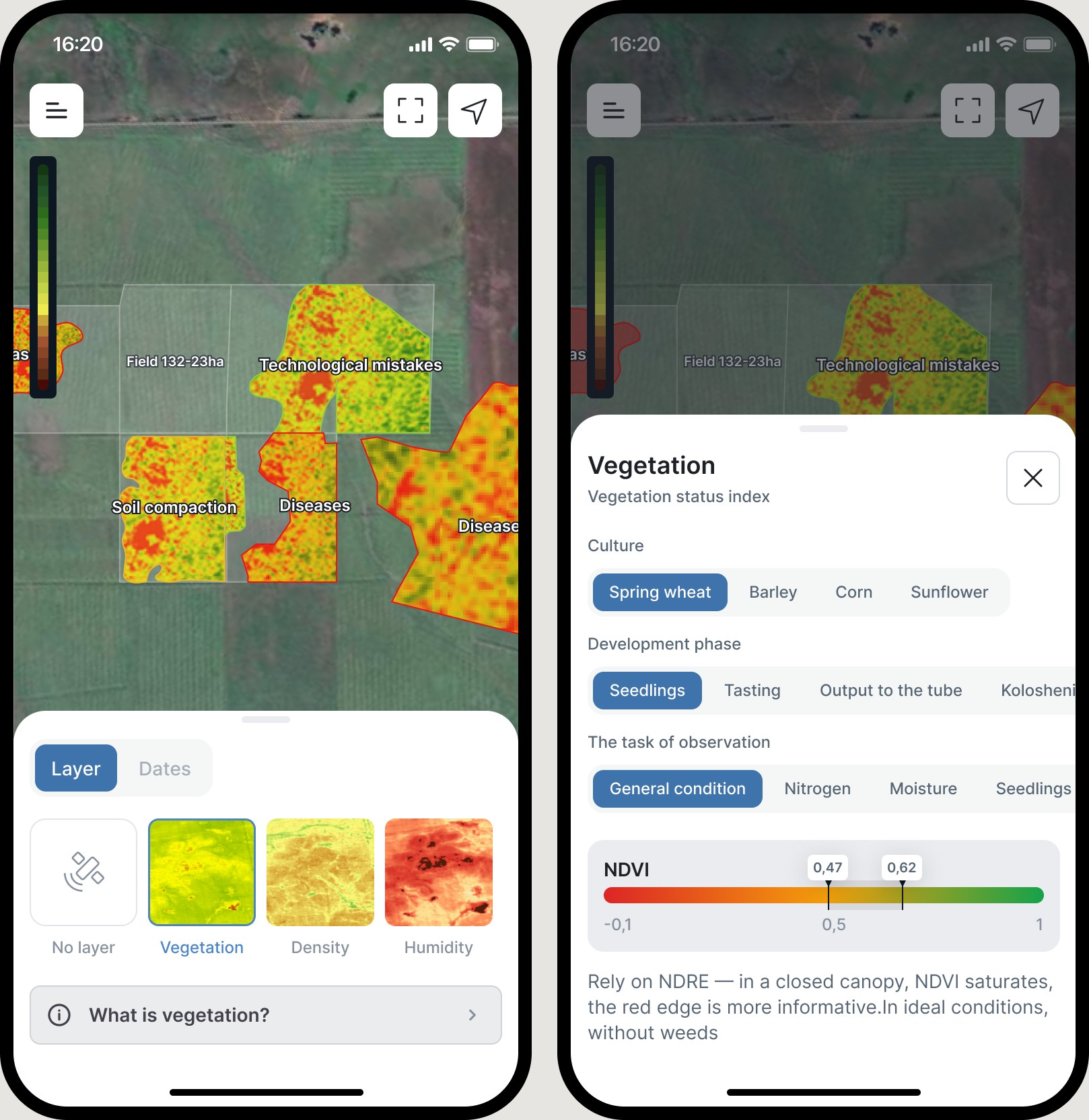
Unfamiliar terms are explained on the spot. “What is vegetation?” opens in a bottom sheet — no need to leave the screen.
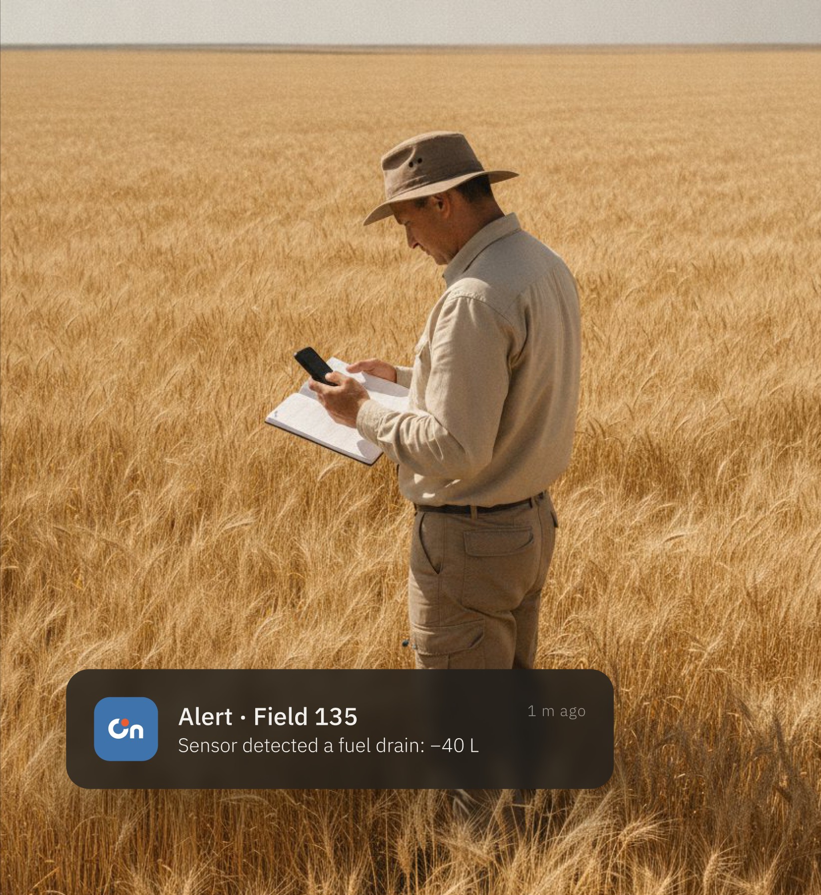
A tractor broke down in one of the fields and needs help. Or a sensor recorded that 40 litres of diesel vanished from a tank right on site.
Alerts come in different types, and each one immediately answers the questions a manager would ask: what happened, where, who the driver is, whether they’re assigned, who’s responsible.
Notifications come in three types: alerts (red), warnings (yellow) and info (blue). From any of them you can open the details of what happened — and call the right person straight away.
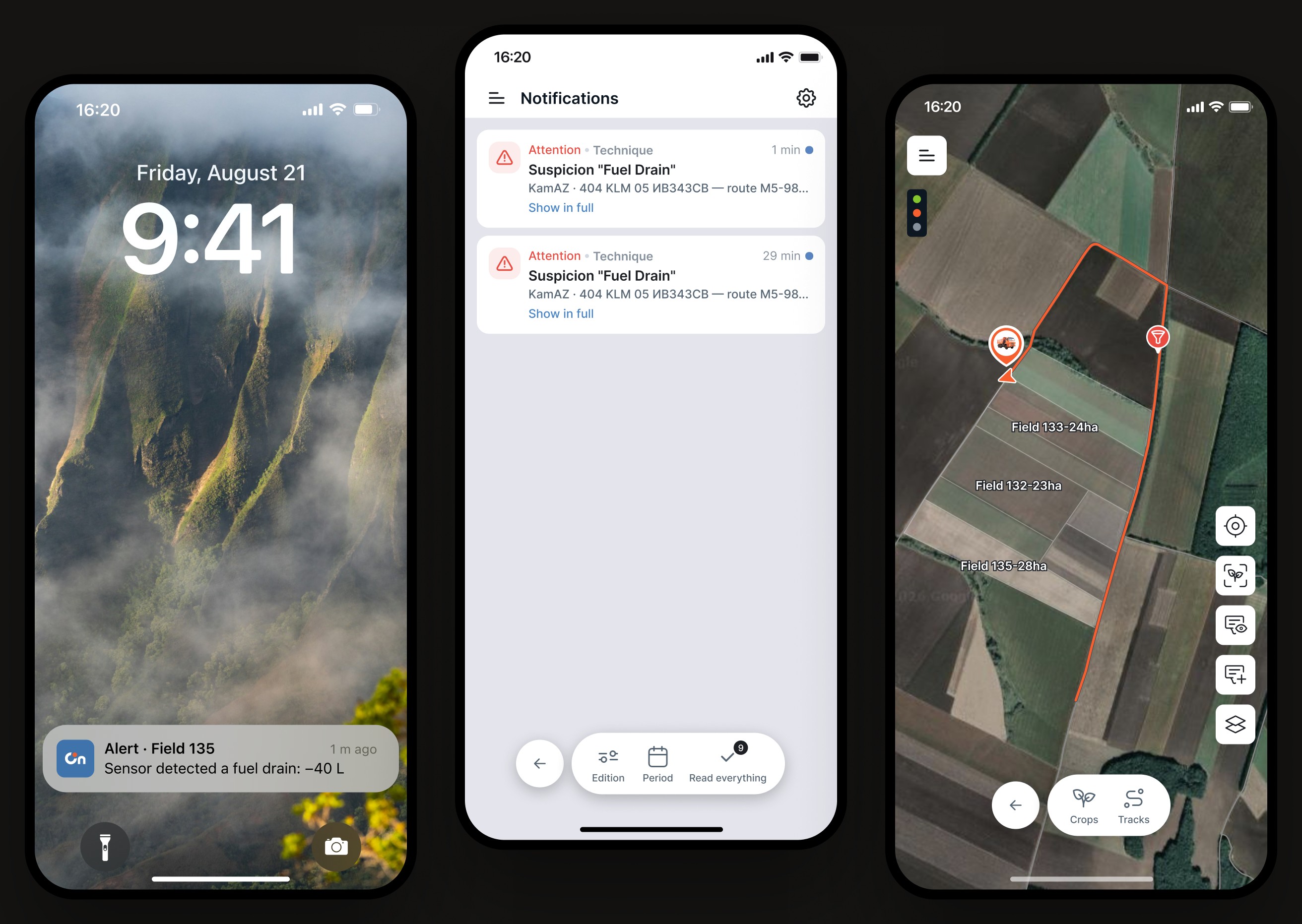
An alert isn’t a notification. It’s a ready answer: what, where, and who to ask.
Five answers on one card — before the manager has to ask. And one action: call.
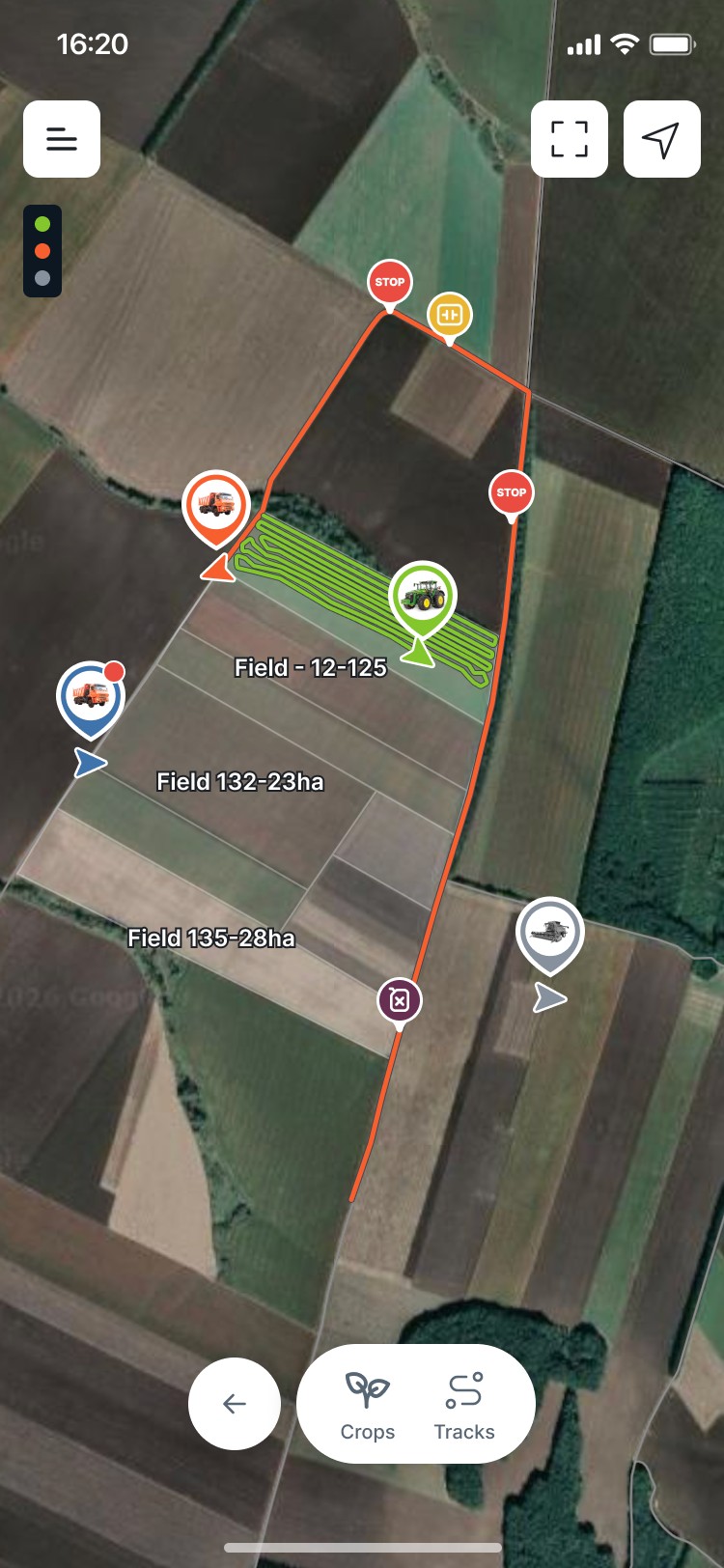
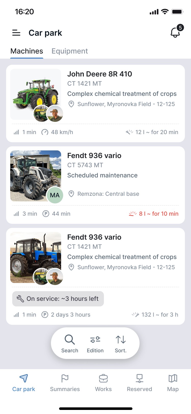
Then the fleet: all machinery on the map, movement tracks, details for every vehicle.

Sown on 5 May, logged in the system. Then everything that happened to the crop: rates, timing, treatments, where and how it was sown. The hard part was making the comparison readable on a phone: each plot is compared with the other plots in the farm’s experience.
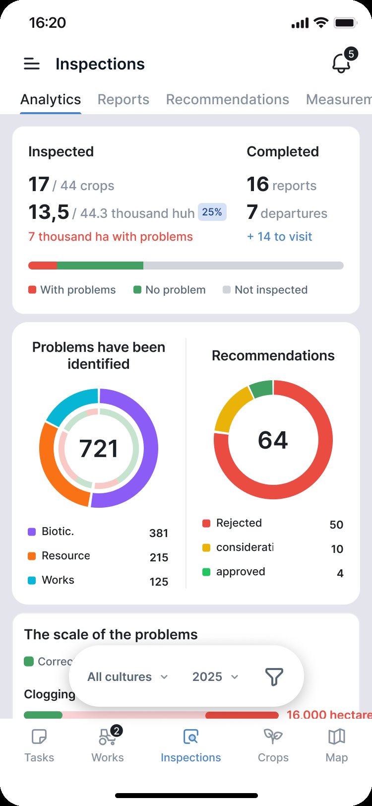
At the end of the season the app compares the plan with reality. A chart shows how far we deviated and why — the weather didn’t allow it, or there were other reasons.
In the first year the record can be entered by hand or collected live during the season. The next year it becomes the plan.
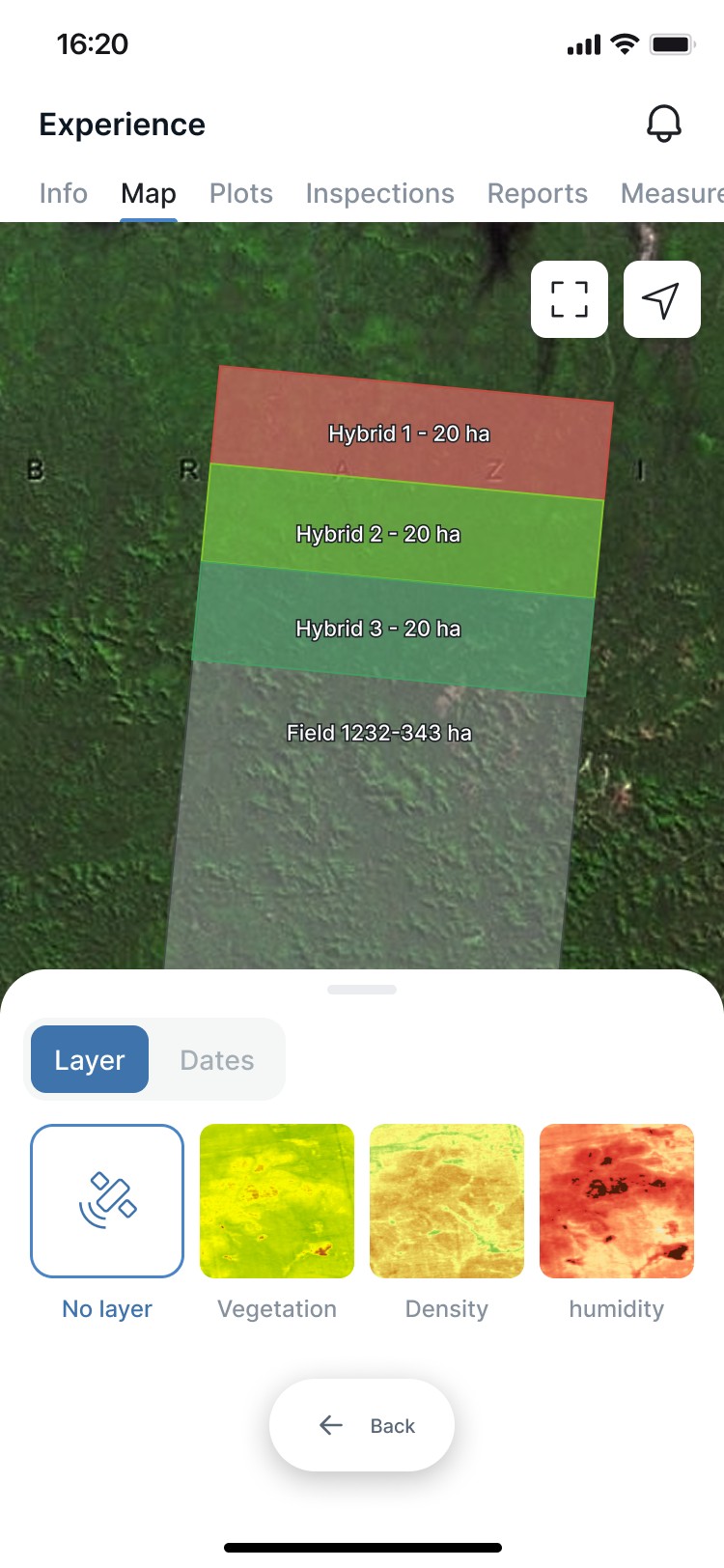
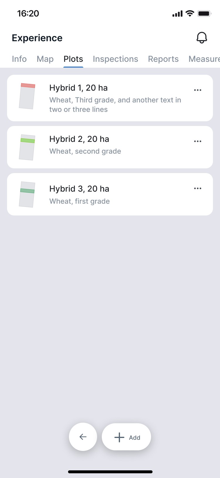
This year — experience. Next year — the plan.
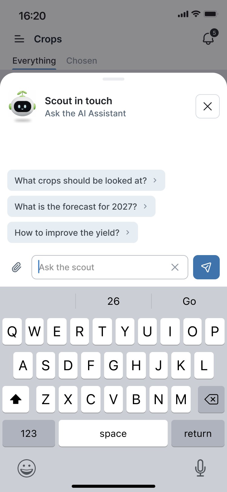
The assistant has all of the farm’s data, so it works as the manager’s personal assistant. It answers any question about the business, gives advice and forecasts — or simply shows where things are in the app.
It lives one tap away on every screen: the little robot in the corner.
A season of data. One conversation.
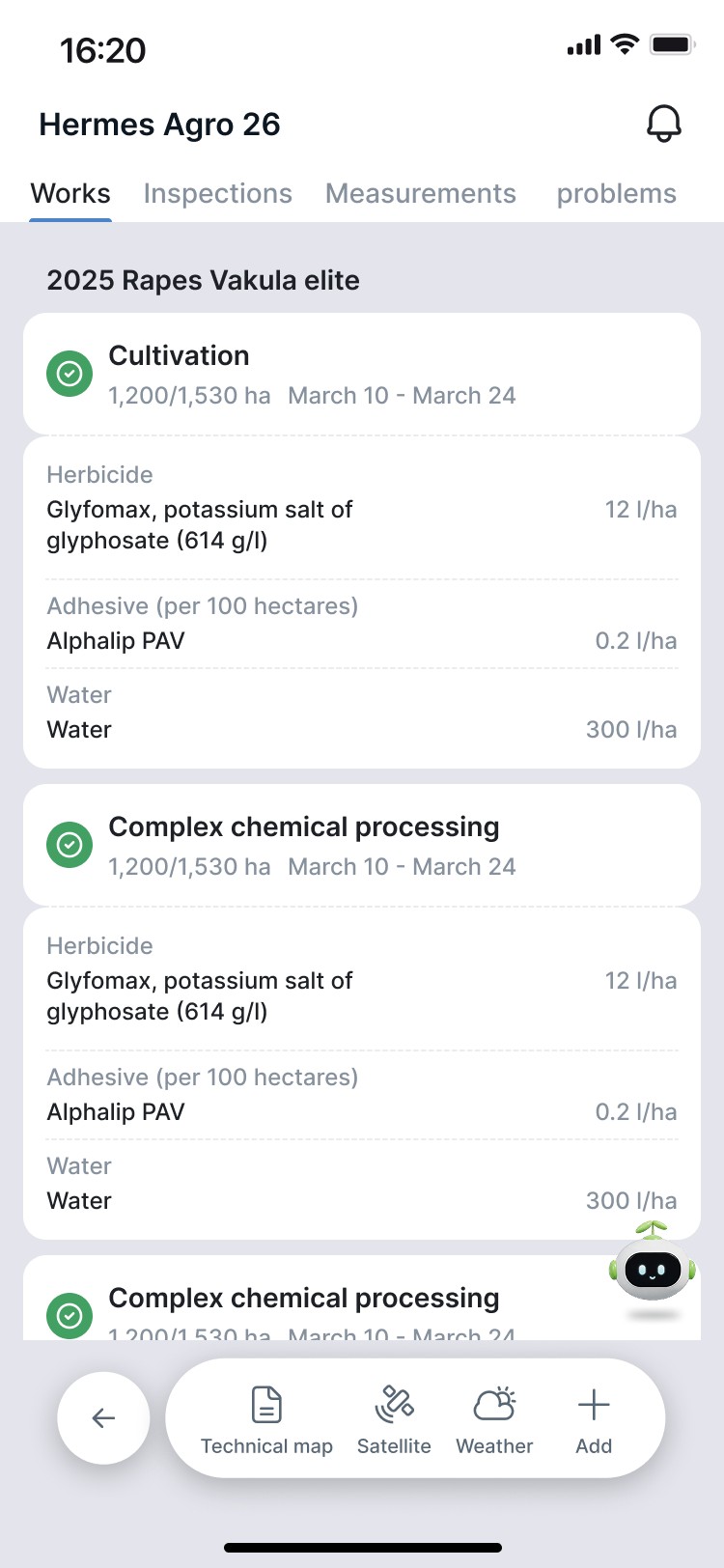
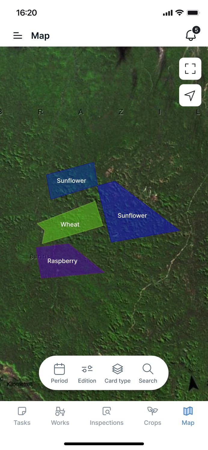
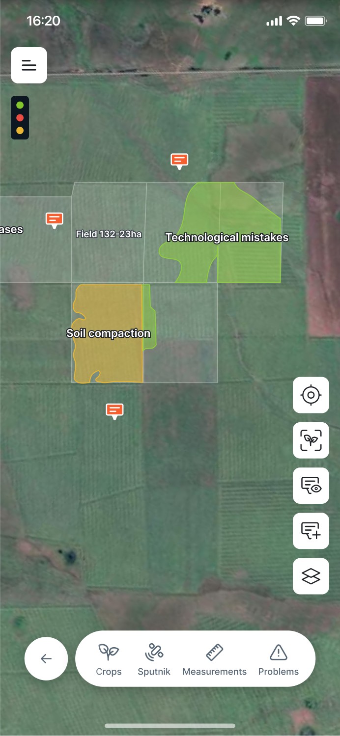
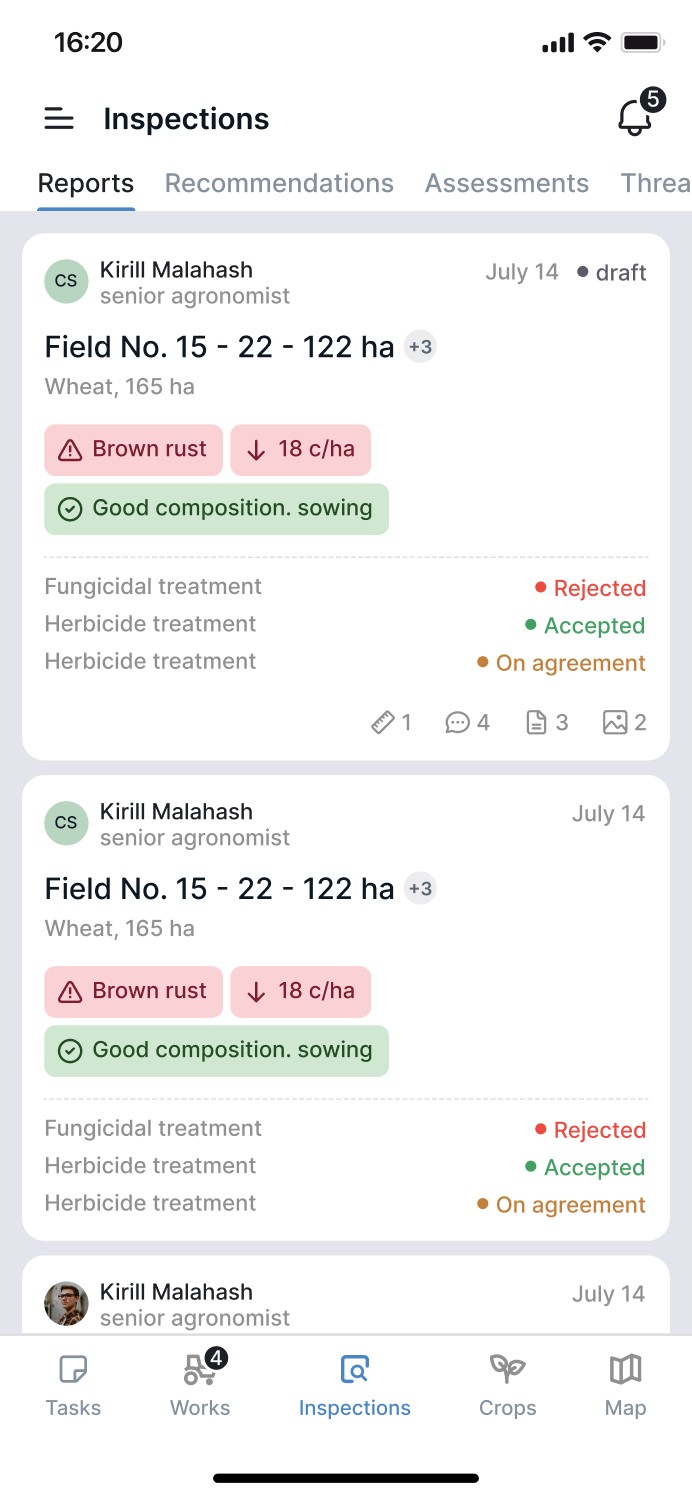
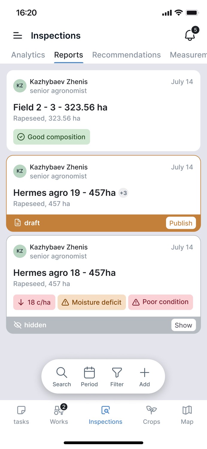
They didn’t meet users’ needs or weren’t easy to scan at a glance. Most of them carried too much information — we kept simplifying until a version worked in the field.
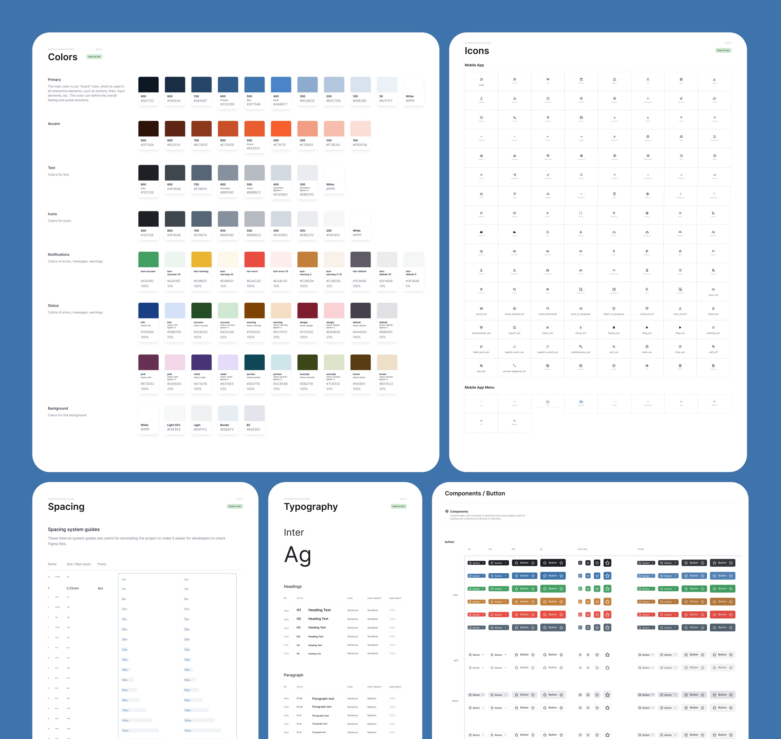
Every screen is built from one OnTrack design system: bottom sheets with list variants, buttons with sizes, variants and states, 100+ icons, and map pins for machinery events — from parking to fuel drain.
The app is live in production and runs on 640,000+ hectares.
Task success — 7 rounds of usability testing with 4–6 client employees.
Field contour time — moderated session, one field.
Alert reaction time — client feedback.
Weekly active users — post-release analytics.
Task success rate
Minutes to outline a field
Alert reaction time
Weekly active users